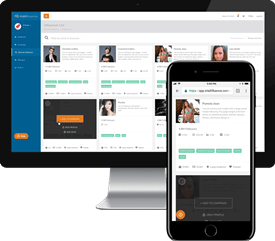
At the end of April we pushed out our v3 app look and feel; at that time, the updated fonts, CSS, and Javascript put the app slightly ahead of the public facing site in terms of where we wanted our look and feel to be, so we spent much of May getting a fresh new look for Intellifluence. While some of it is definitely cosmetic, we made some code changes to improve access to data for those that aren’t logged in.
For instance…
Here’s how our public influencer profiles looked before:

And here’s what the new public influencer profiles look like:
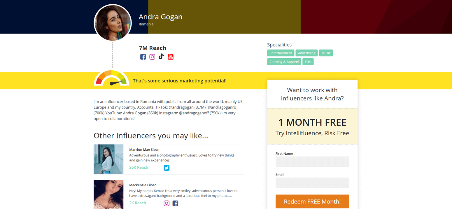
It’s definitely an upgrade as we were limiting quite a bit on what could show outside of the app; it’s still only a fraction of what we have though, so if you’re looking for someone specific, log in.
That’s more for prospective brand benefits, but how about influencers? Oh, you know we love you too. Our syndicated public offers got a huge makeover that hope you like.
BEFORE
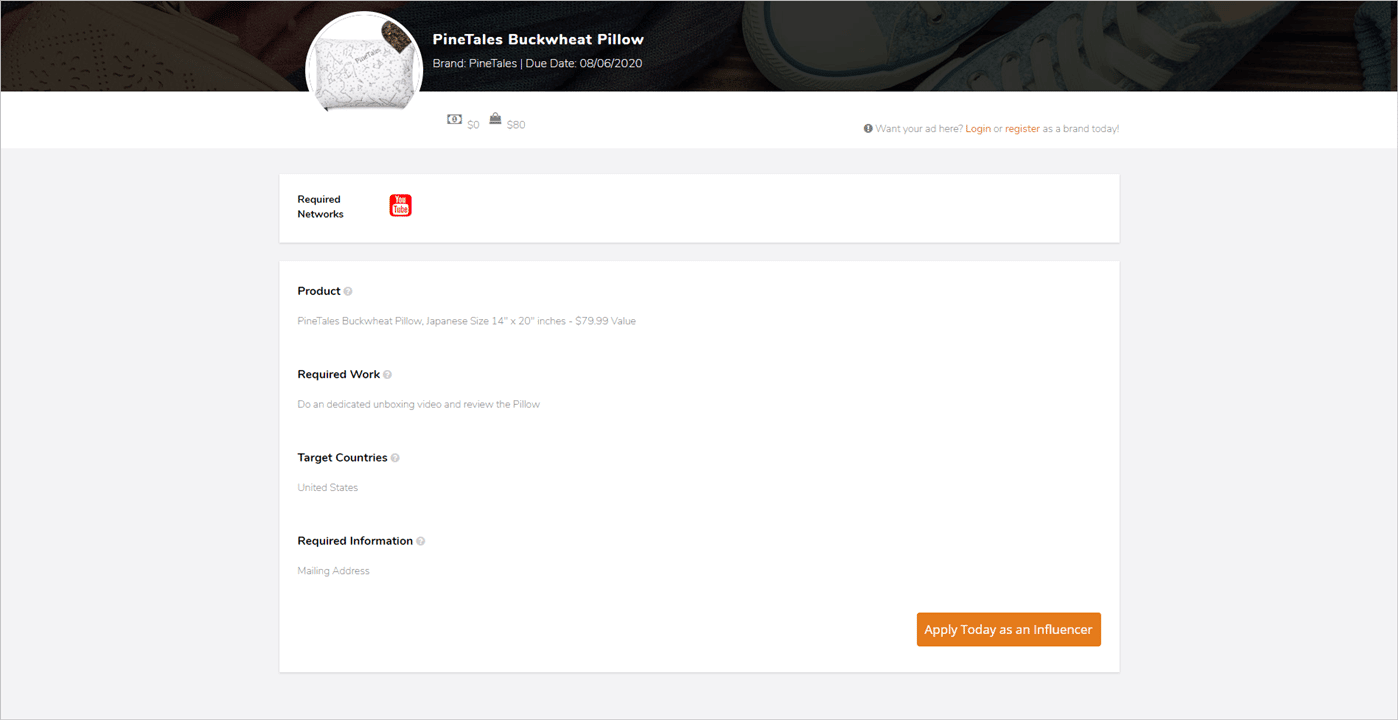
AFTER
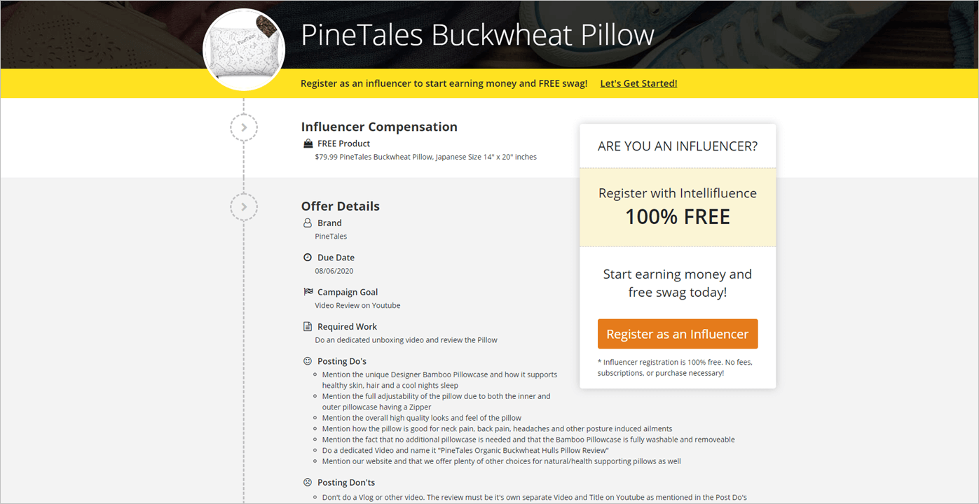
Similar to public profiles, you can see that we’re trying to provide more details and enrich the content to help influencers better decisions when deciding if Intellifluence is right for them (Shhh. It is.)
I’ll say this was definitely another great Intellifluence team effort because I try to stay as far away from design decisions as I can, otherwise you’d be getting something that resembles a crumbling red brick covered in duct tape and cat hair. Kudos team!
I hope you like the new site and find it easier to use.

Joe, CEO and Co-Founder of Intellifluence, has over 25 years of experience in SEO, leading several successful marketing companies and providing expert consultation. He is the author of The Ultimate Guide to Using Influencer Marketing, which is available as an eBook or in print.