Last Updated on June 8, 2020
This year is absolutely flying by! It seems like just yesterday we launched the first version of Intellifluence, in 100F+ temperatures, and soon we’ll be dealing with 100F+ temperatures again here in Scottsdale. Don’t feel bad for us, we had a lovely 4 month fallwinterspring.
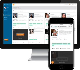
You’re not here to hear me talk about the weather though, are you? No, chances are you saw a cryptic link drop from me on my social accounts or received an email stating that you should check it, so enough teasing. Introducing project Albatross Milkshake, aka version 2.0 of Intellifluence’s backend system.
Albatross [ˈalbəˌtrôs]
NOUN
- a very large oceanic bird related to the shearwaters, with long narrow wings. Albatrosses, some species of which have wingspans greater than 10 feet (3.3 m), are found mainly in the southern oceans, with three kinds in the North Pacific.
- a source of frustration or guilt; an encumbrance (in allusion to Coleridge’s The Rime of the Ancient Mariner).
In this particular case, we’re going with the second definition; we had a fairly successful launch of Product Hunt, kept growing both brands and influencers steadily, and then nabbed over 1,000 new brands from our AppSumo deal. It was through this deal that the feedback REALLY started coming in, which frustrated both everyone that was filing tickets (I assume) and those of us diligently answering those tickets (this I know for certain). Thus, we set to undertake an albatross, which is an apt descriptor for every re-design ever.
Milkshake [milk shake]
NOUN
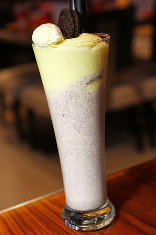
Milkshakes are awesome; unless you’re lactose intolerant, they probably bring a smile to your face when placed in front of you…and even if you are lactose intolerant you probably smile at least a little. For us, the milkshake represents what we wanted to offer both brands and influencers using our system: joy.
Let’s dig into this milkshake with a long silver spoon and see what goodness we have planned for you:
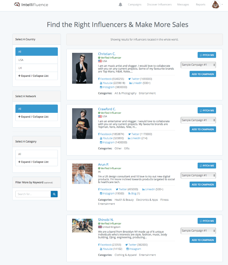
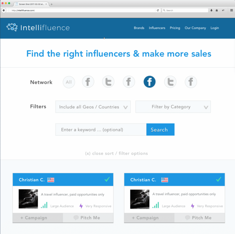
Easier discovery filters: some of the most common feedback was asking to place filters on top of the discovery process, to save some scrolling. Anytime we can save users a mouse click, scroll, query, or any other action, we want to do it.
Old and busted
New hotness
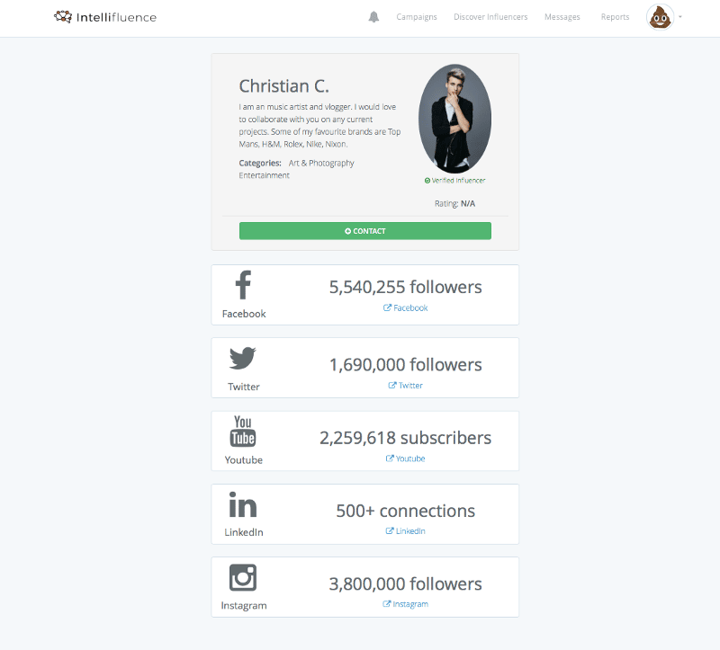
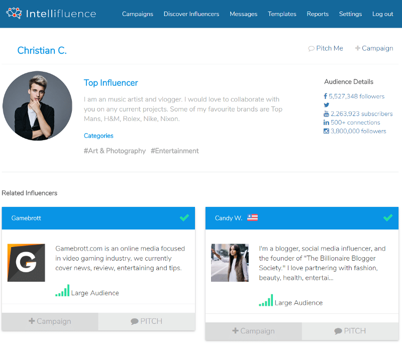
We were pretty disappointed in how the old influencer profile view looked, so we completely redid it to provide a richer snapshot of who the influencer is; now brands can go deep dive on similar influencers, add directly to categories, and more.
Old and busted
New hotness
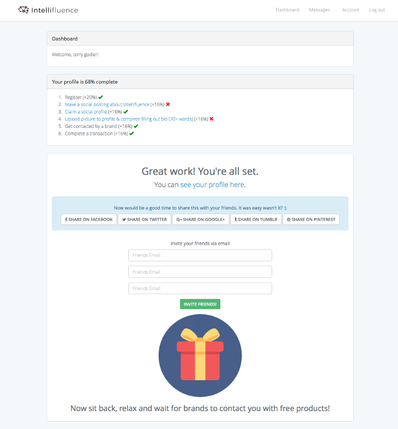
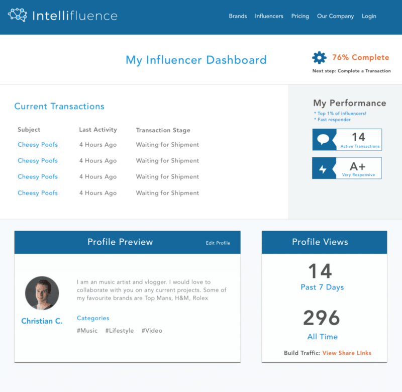
The influencer dashboard jumped by a few light years in look and feel. Welcome to 2017 Intellifluence influencers; do not feel disoriented if you’re still listening to grunge music on portable CD players and wearing flannel. While the 90s were a fabulous decade, we wanted to forget it from a design perspective and make life easier. Why were we forcing influencers to click externally to see which messages existed for them? Why weren’t we letting them know they’re being checked out? There’s a lot more stats that influencers get to see about themselves; not all of it I’ll be making public just yet. There’s some really exciting things coming that make being an influencer with us rather rewarding.
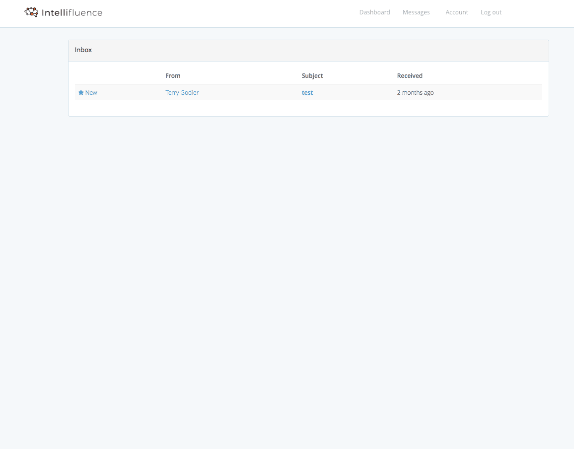
Old and busted
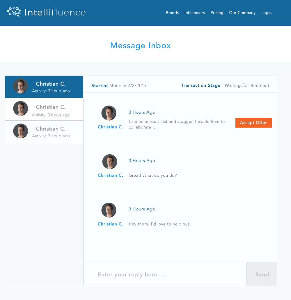
New hotness
I received feedback on this pretty much everyday, including this morning. “Joe, why can’t I see who I’m writing?”
“Joe, why isn’t this like an inbox?”
“Dear sirs, I am a prince and would like to give you $5m to hold in your account while I hide in the wilderness. For your troubles, you will keep $1m.”
I can’t wait to not get tickets and emails about this as of…now?
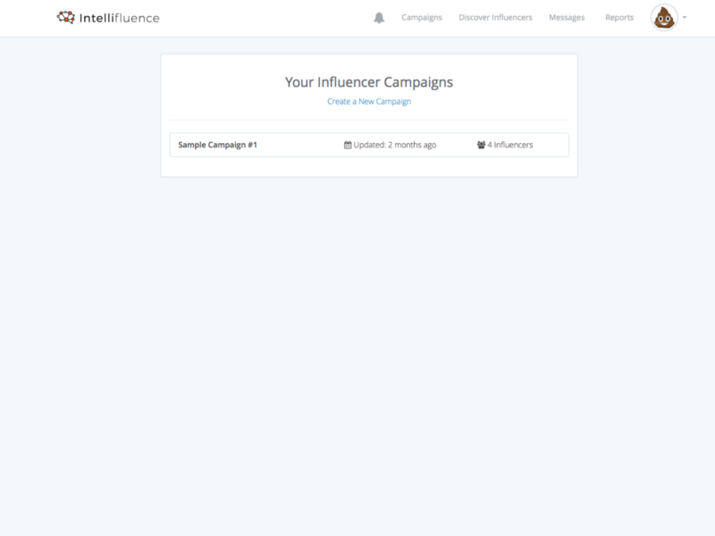
Old and busted
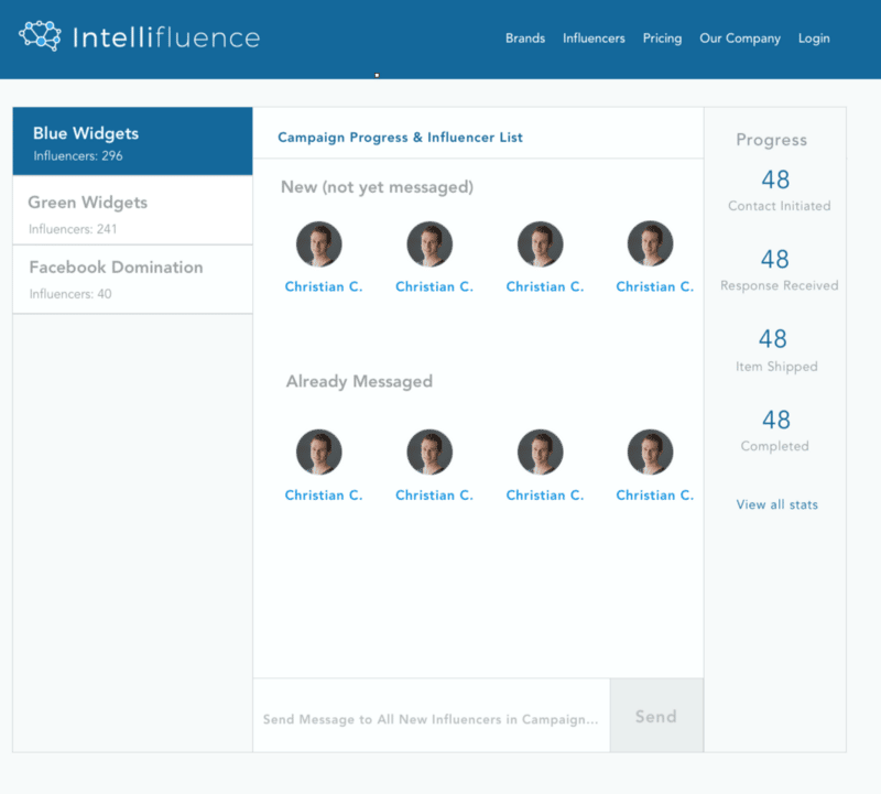
New hotness
Campaigns weren’t necessarily a bolt-on for us, but they sure looked like it. Now we have a campaign view that brands agencies will be pleased to see — more information at the finger tips, getting rid of multiple mouse clicks.
There’s a lot more visual and structural changes that are occurring with the update, but by now you should get the idea. We changed a LOT. :)
Pricing
Keeping with our philosophy of setting pricing as low as we possibility can in a way that reflects both demand and value provided, ensuring that the value/$ spent equation is always in favor of Intellifluence vs the competition, we are raising prices to coincide with the relaunch. As always, if you’re already a subscriber your pricing is going to remain exactly the same — grandfathering is our way of saying “thank you for sticking with us” as we continue to evolve and improve value more and more.
Intro, $39/mo — our “getting to know you” plan, ideally suited for small businesses with a single product to sell. It comes with unlimited messaging and a ridiculously low price point.
Standard, $59/mo — this is our most popular plan; Standard is the ideal choice if you need to segment your outreach into campaigns and want reporting data. Since it is our most popular plan, we tried to keep pricing as close as we could to Intro.
Pro, $129/mo — do you work on a larger team or agency that requires multiple logins? Pro is for you. Every feature we currently have is accessible by the Pro plan.
So that’s our Project Albatross Milkshake. Born from the milkshakes Terry and I consumed in Las Vegas and his redesign brainchild, we come before you with an improved way to undertake influencer marketing. Want in?

Joe, CEO and Co-Founder of Intellifluence, has over 25 years of experience in SEO, leading several successful marketing companies and providing expert consultation. He is the author of The Ultimate Guide to Using Influencer Marketing, which is available as an eBook or in print.


